Rand Hydrogen is driving the global adoption of green hydrogen. They produce it, distribute it, and help industry use it, with a clear perspective on what the energy transition actually requires.
Founded by renewables expert Hando Rand, the mission is ambitious but grounded: make green energy accessible and affordable. And help Europe hit two hard targets — a 55% emissions reduction by 2030 and carbon neutrality by 2050. The dual pillars of the continent's climate commitment.
Our challenge was clear: position green hydrogen and Rand Hydrogen as a powerful new force in the energy landscape. Capable of competing with established industrial players. Representing a new generation of cleantech. The brand had to communicate not just technical depth, but genuine environmental commitment at a decisive moment for Europe.
WHAT WE DID
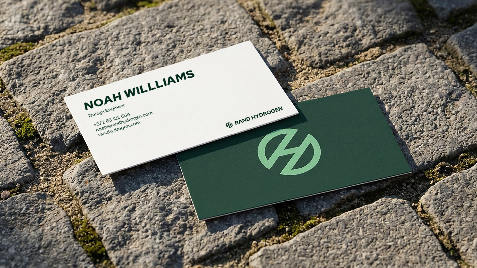
Brand Identity System
Imagery Art Direction
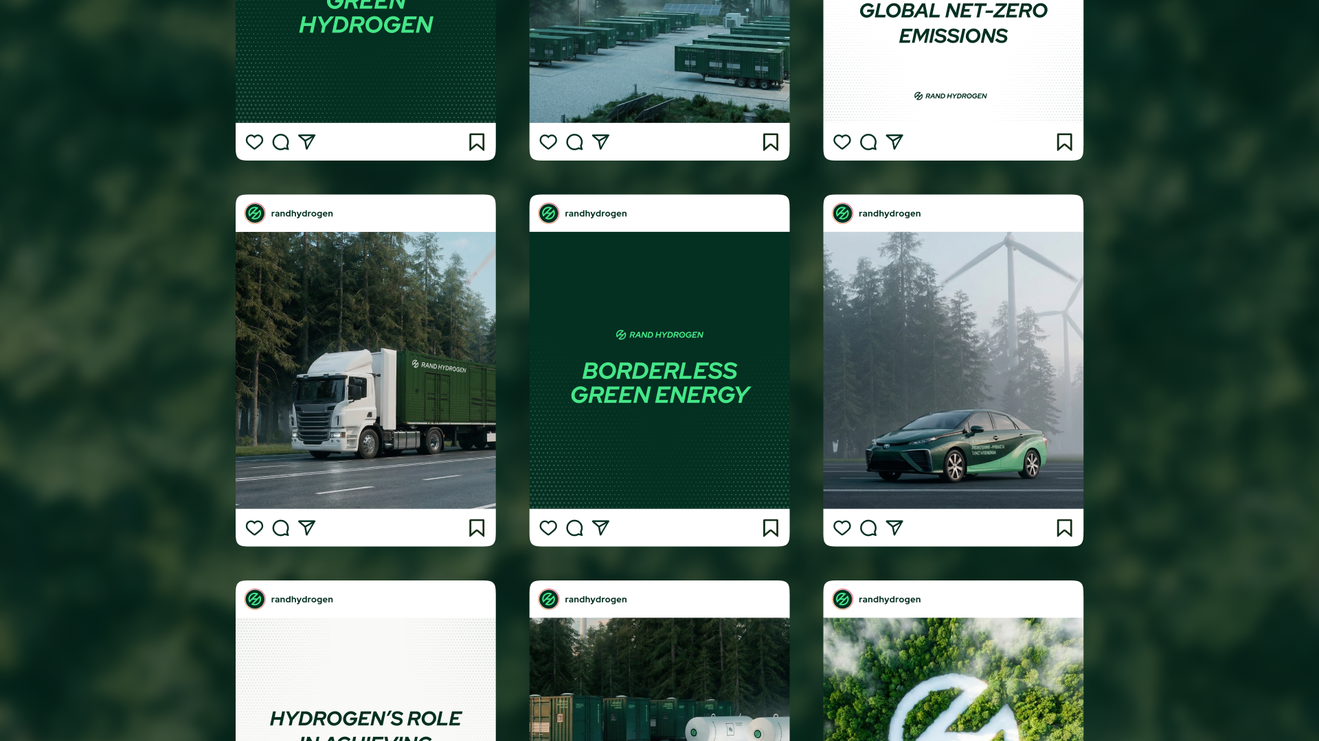
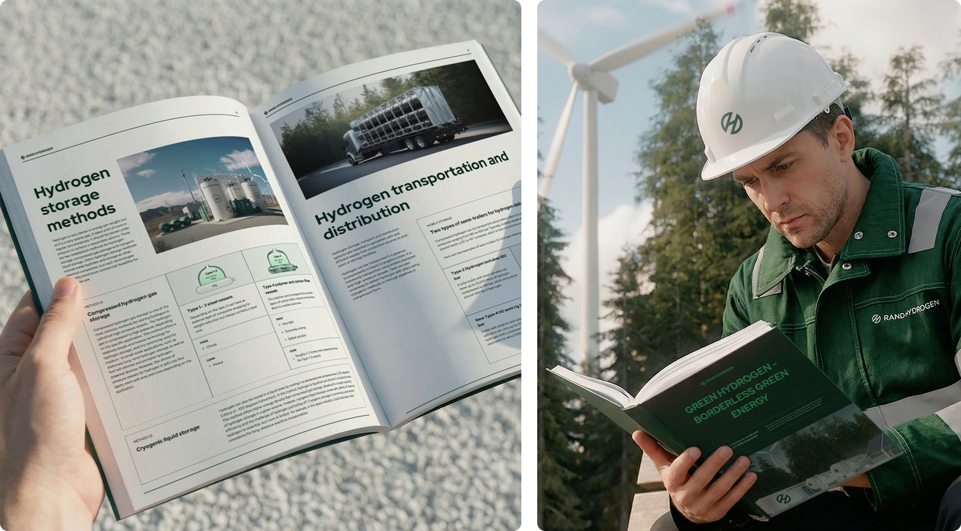
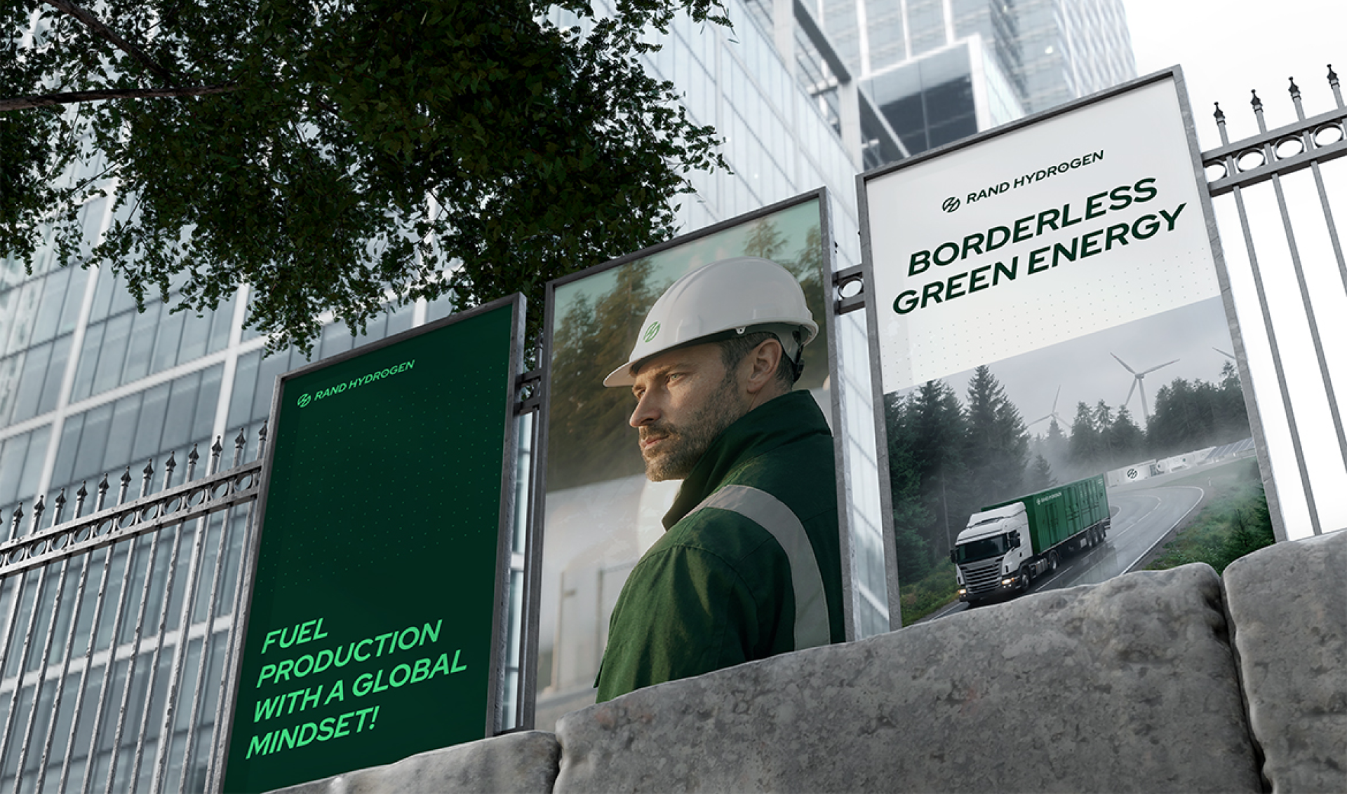
Marketing & Sales Materials
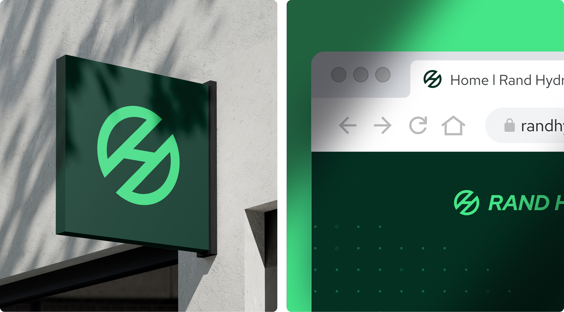
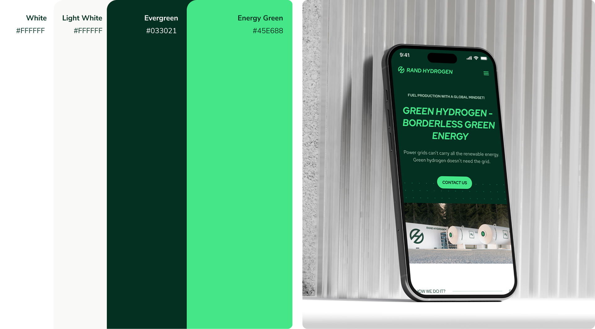
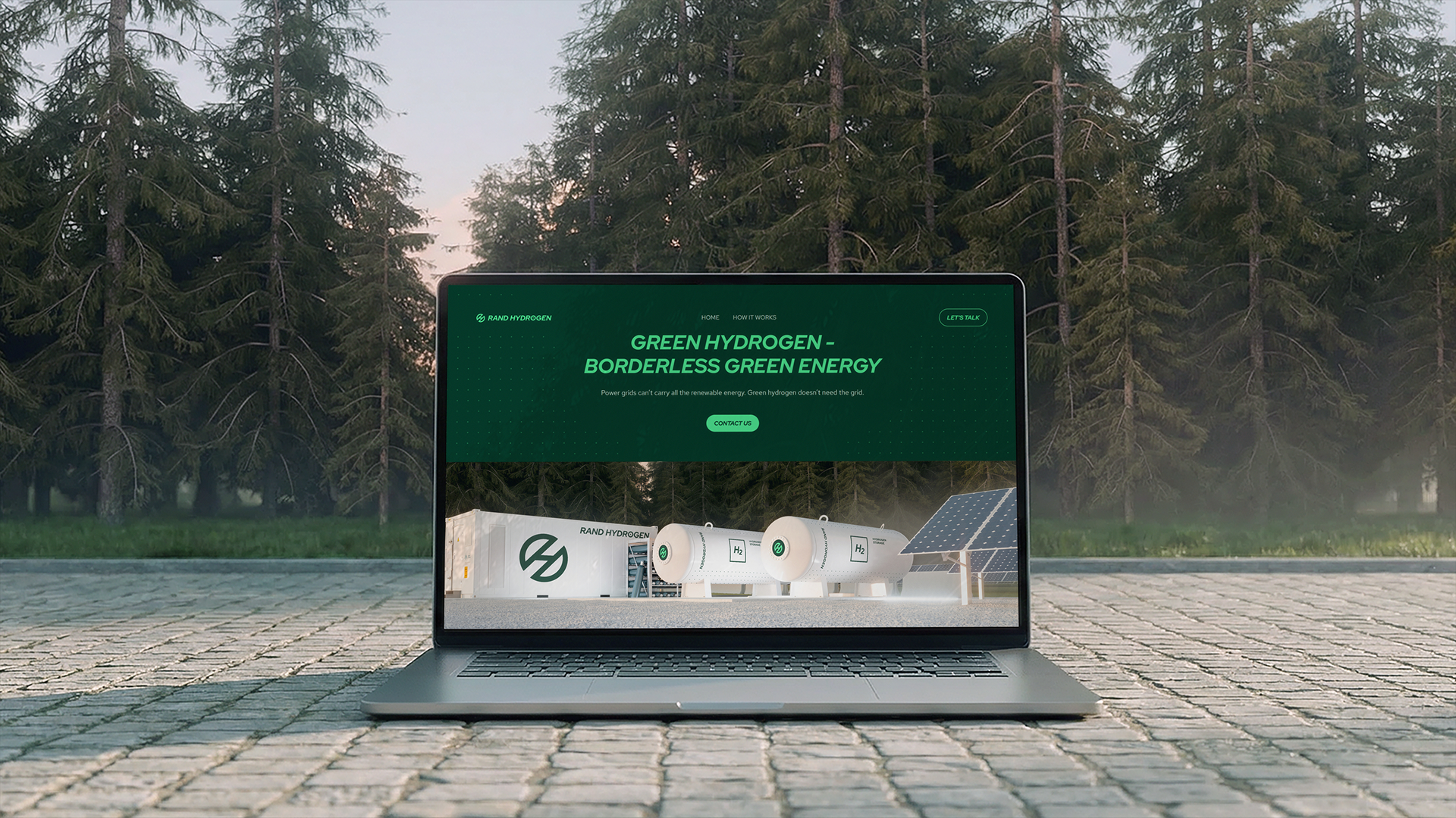
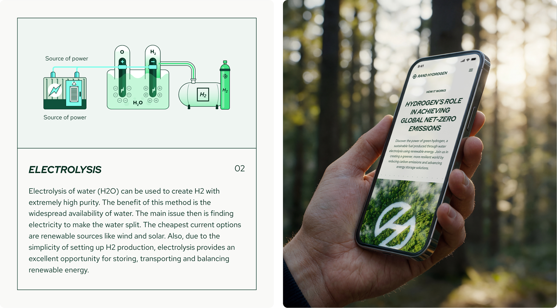
Website Design
Imagery Art Direction
Marketing & Sales Materials
Website Design
BRAND EXPRESSION
At the heart of the brand is one belief: powerful energy that works in harmony with nature.
Rand Hydrogen isn't about asking industry to sacrifice. It's about finding the path where industrial strength and environmental responsibility move forward together.
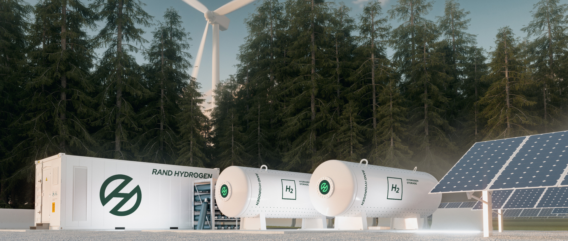
Here's the real insight. Europe produces abundant renewable energy, but much of it gets wasted. Solar and wind farms generate more clean power than the grid can hold or transport. Batteries can only store so much. Meanwhile, industry needs fuel it can rely on.
Rand Hydrogen bridges that gap. They take unused renewable energy and turn it into green hydrogen. A clean fuel easy to store, transport, and use with confidence. No conflict between growth and sustainability. Energy that works with nature, not against it.
The brand is built around four pillars: Powerful. Modern. Professional. Environmentally Committed. Every touchpoint, logo, website, technical documentation, reinforces the same idea. Rand Hydrogen is the team building the infrastructure that makes industrial decarbonization real.
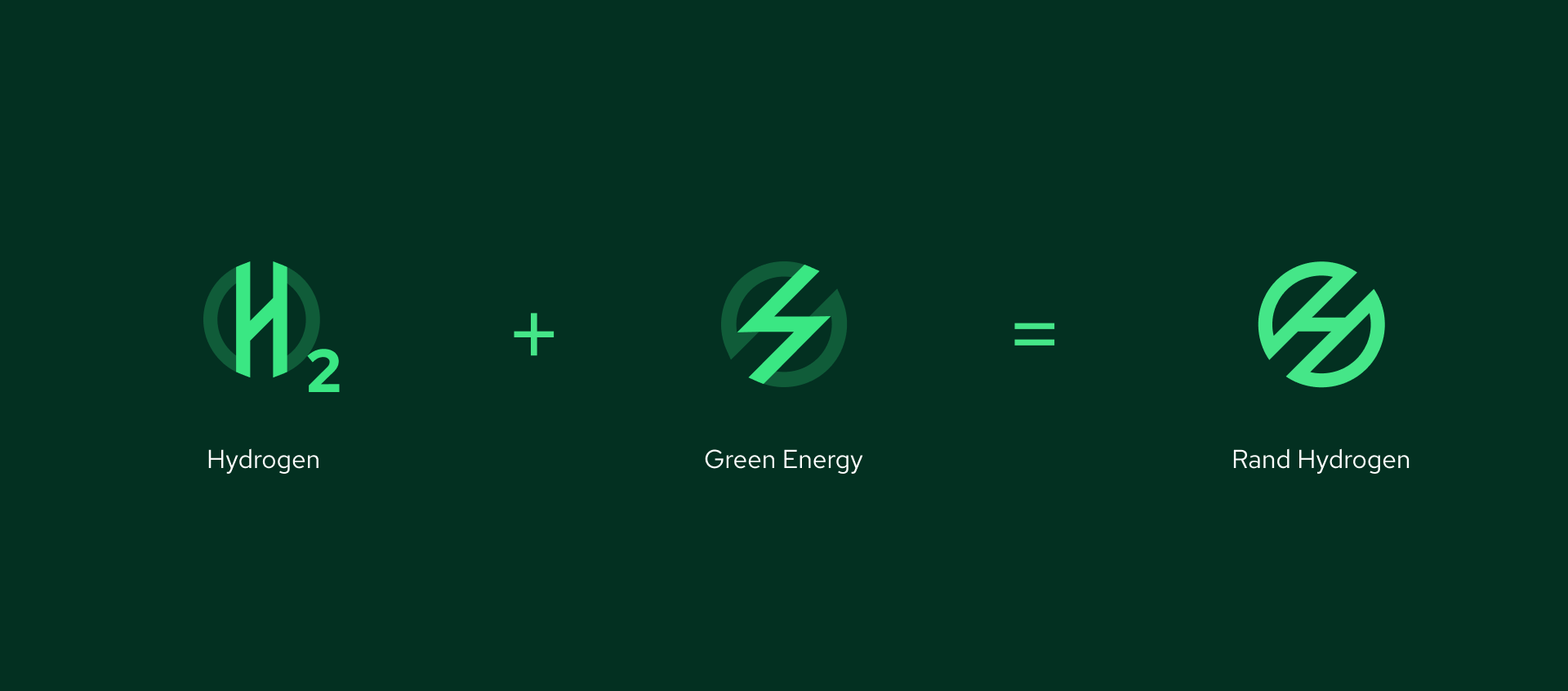
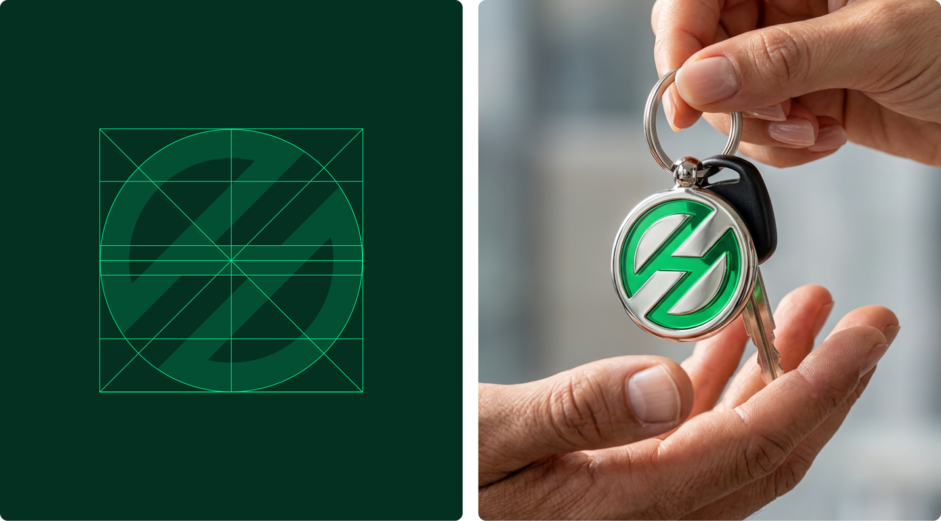
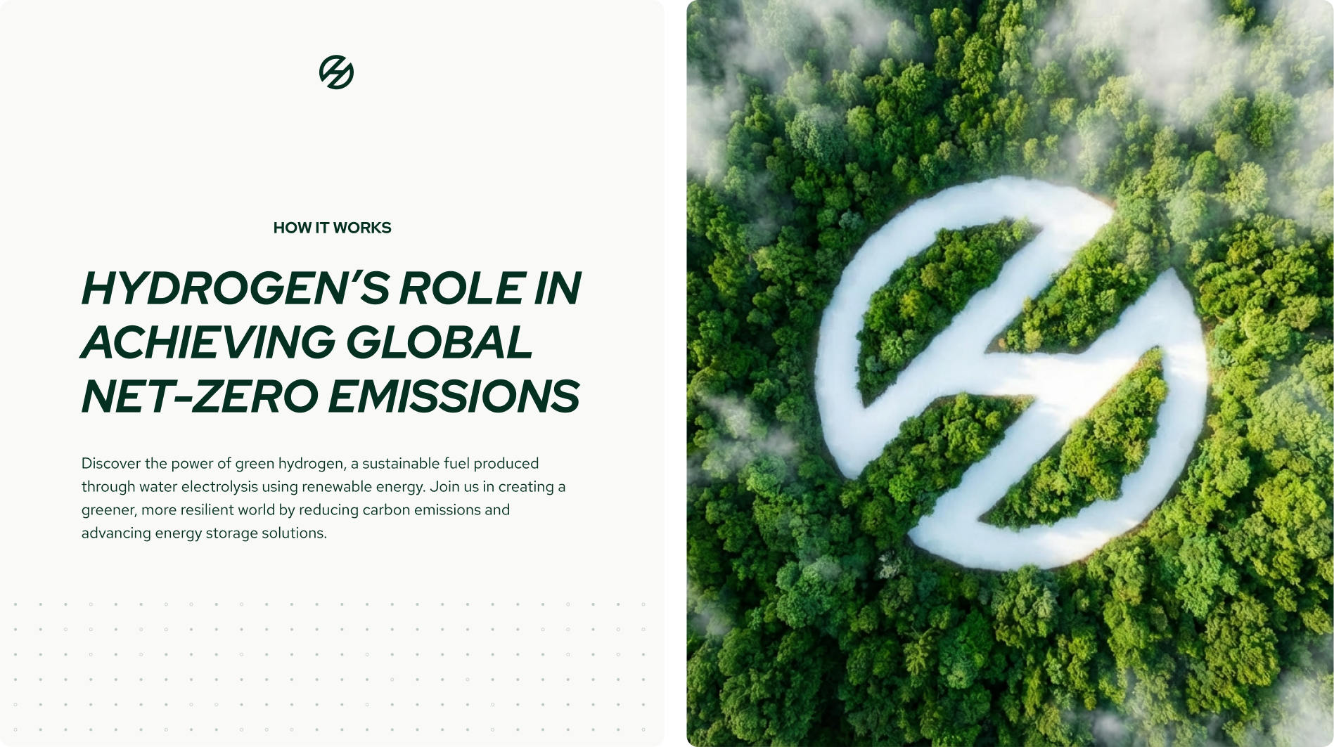
THE SYBOL
The vision behind the mark is simple: when people anywhere in the world think about green hydrogen, the first image in their mind is Rand Hydrogen's symbol.
It draws from hydrogen's transformative nature, representing both its molecular structure and the forward momentum of the energy transition. The essence of transformation. The conversion of renewable electricity and water into clean, boundless fuel.
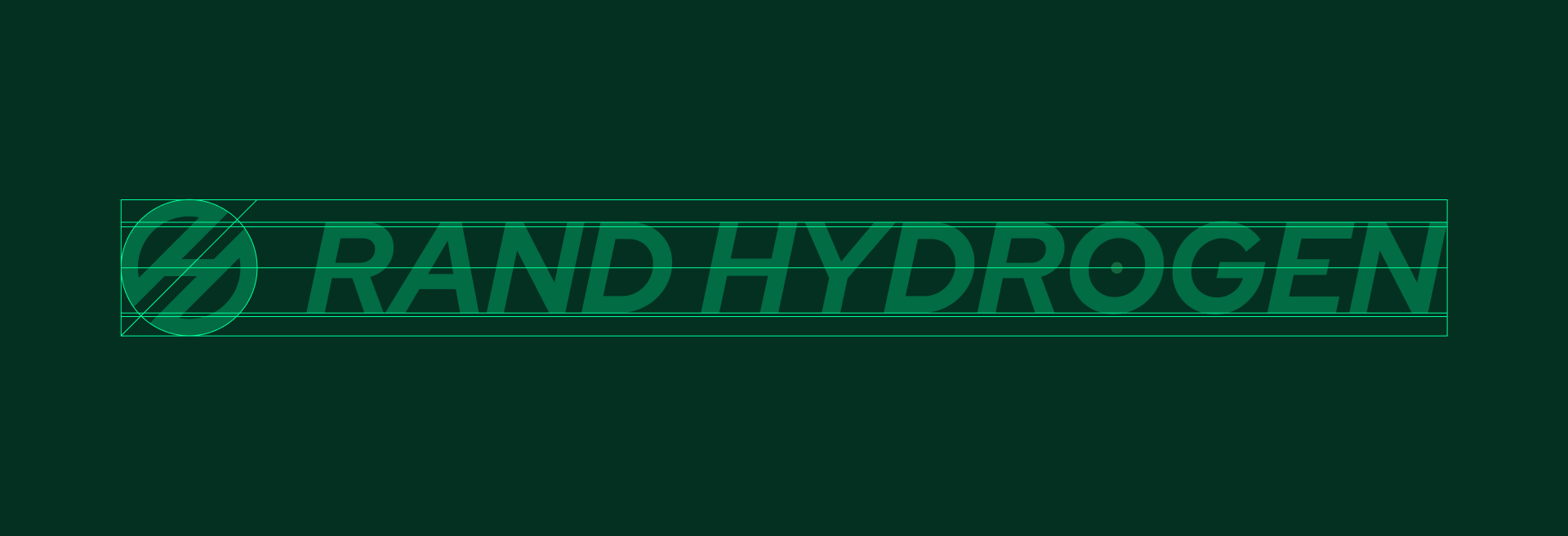
COLOR & TYPOGRAPHY
The palette balances saturated energy with earthy groundedness. A visual analogy of producing energy in harmony with nature. Evergreen is the primary color. An earthy, sophisticated green drawn from the dark forests of Estonia. It builds trust. It signals deep environmental commitment. Energy Green is the secondary. Vibrant, saturated, charged. It represents the explosive clean power hydrogen delivers. It leads calls-to-action and key messages.
Together they define Rand Hydrogen. Grounded in responsibility. Energized by innovation.
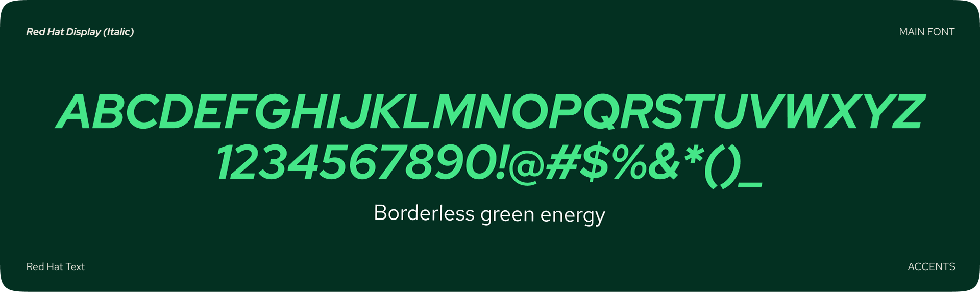
Two typefaces complete the brand identity system. Red Hat Display Extra Bold Italic for headlines. Forward, confident, in motion. Red Hat Text for body copy. Clear, readable, everywhere.

APPLICATIONS
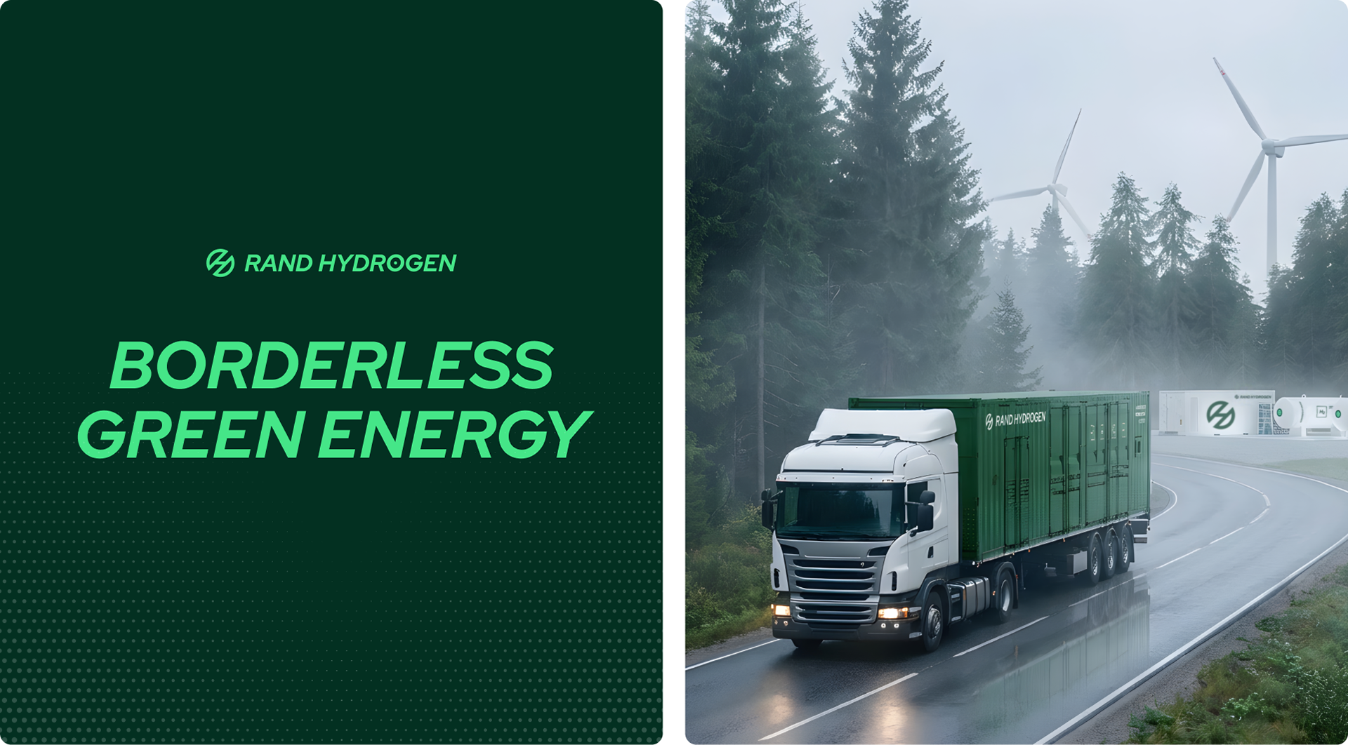
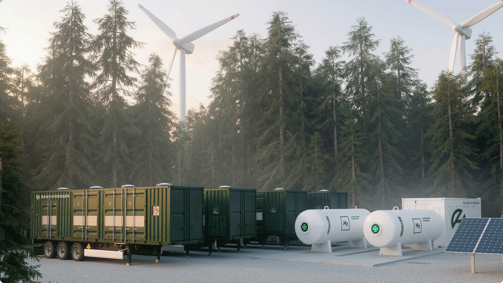
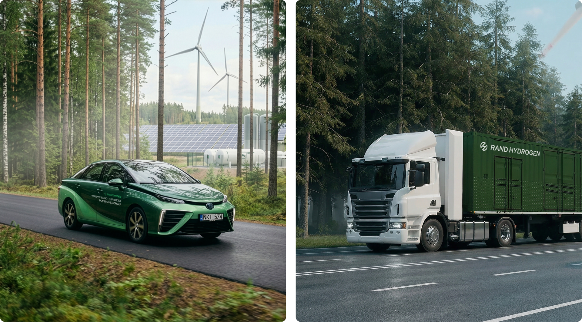
The brand system is built to travel. From marketing materials to a hydrogen car for promotions, to the containers that houses an electrolyser — making it easy to produce hydrogen across the Baltics. The system is flexible and simple enough to work anywhere and keep its identity intact. The only limit is the reach of Rand Hydrogen's vision.
"From the first creative routes David presented, we were impressed by the quality and clarity. The process was fast, easy, and genuinely fun to work through. David's initiative and thoroughness stood out and we felt supported every step. Since this project, we've continued working together on other initiatives, and Daviferent consistently delivers the same high quality. Most importantly, the brand immediately added a strong layer of trust to all our communications. We're thrilled with the result."
Hando Rand
Founder & CEO, Rand Hydrogen
Founder & CEO, Rand Hydrogen
Get in touch!
Do you want to create an unique brand and digital experience, that engages, and is loved by everyone? I create intentionally with a focus on achieving your business goals, drive growth and reach your next milestone.
Let's connect and explore how I can contribute to your success!
Book a call | david@daviferent.com